![]() The new update to Ancestry’s app for iPad, iPhone, and iPod touch is now available in the app store.
The new update to Ancestry’s app for iPad, iPhone, and iPod touch is now available in the app store.
The app can now notify you when Ancestry.com finds information it thinks relevant to your ancestors. Enabling this optional feature will cause the little red number badge to appear on the Ancestry app icon when Ancestry.com finds new information. If you’d like to use this feature, be sure to allow push notifications when prompted after launching the updated app for the first time.
Speaking of people with hints, the app can now give you a list of all of them in one place. You reach this by clicking the search button then clicking the “People with Hints” part of the segmented control at the bottom of the person index.
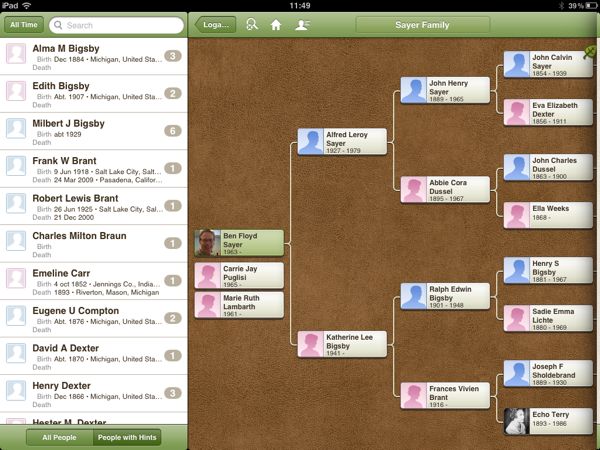
Ancestry have also added a relationship calculator to the app. When anyone other than the root person in the tree is selected, the app displays a disclosure button next to the text “View relationship to me” in the person view.
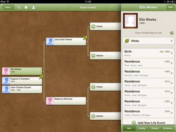
It will then display not only the relationship to you, but to each person along the line of descent down to you. I haven’t tested this with a large tree so I don’t know how many ancestors it can handle in that line of descent. If you’ve got a big tree, give it a try and tell me how it works in a comment below.
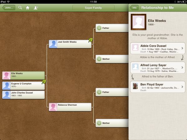
Once the app determines a relationship with a person, it displays that relationship on the person view instead of the “View relationship to me” text.

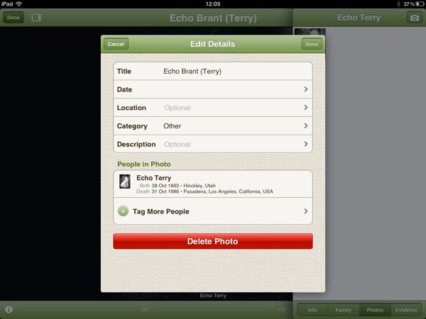
You can now record additional information about photos. The fields are now: date, location, category, and description. You can also tag people in the photo. This updated, “Edit Details” pane can be reached by clicking the small “i” button at the bottom left of a photo. I noticed that some photos had this button and others didn’t. I don’t understand why.
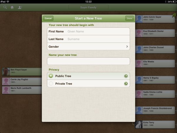
The list of changes said that you can now easily change the privacy settings for each of your trees. I wasn’t able to see how to change the privacy settings for an existing tree; however, you can choose to set the privacy for a new tree you create in the app to either public or private.
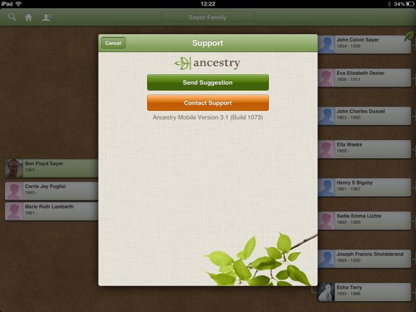
The support view now gives you the option of sending a suggestion or contacting support. Each brings up an short form for sending feedback to ancestry.com, all with from within the ancestry iOS app.
Last in the list of changes in this version, is the obligatory claim of faster more stable performance.
Ben,
Thanks for the detailed information. I had already installed the update when I got your e-mail.
I have a pretty big tree: 3904 individuals. Like a lot of people with north European ancestry, I appear to be descended from Charlemagne. I found him in the tree and touched the View Relationship button. The line between him and me showed up almost instantly.
A big tree takes a little while to load, but once in memory can be accessed quickly. The Search button does not bring up a search field and keyboard, allowing a targeted search, though. It just starts with the letter A, and you have to scroll to the person you want. Or at least that’s how it seems to work. Adding a search field and keyboard would be a big help.
Despite that inconvenience, this is a big step up for the app.
I spoke/typed too soon in my comment earlier today. The Search button DOES bring up a search field. I failed to pull the display down to reveal it. When you tap the field, a keyboard appears, and you can enter a name to search for.
Thanks for that information Bill.